For all of us involved in quality improvement measures within our lab our goal is to drive change. Reporting physician compliance with turnaround time or participating in group peer review sessions to track interpretive variability can often generate some lively conversations! As an educator and consultant, I have facilitated meetings where I have seen first hand interpretive variability or had to report on non-compliance with physician turnaround time. Take ejection fraction as an example of interpretive variability. Although ASE provides guidelines regarding best quantification techniques (Biplane Simpsons Method), the physicians are still faced with the reality of the sonographer’s ability to perform correct techniques while performing the exam! How do we close the loop on subjective ultrasound interpretation and tip the scales to consistently provide accurate interpretations? How do we understand the many issues involved with a physician that may not read a study on time?
I have had some lengthy discussions with some very caring and dedicated physicians regarding how to narrow the diagnostic criteria within a lab and increase turnaround time compliance. I think some of the best words of advice I was ever given as a consultant was from a dear friend and great cardiologist that told me “I am a visual person”. He told me that if I should show him his results in relation to his peers. That would have more of an impact on him than us all sitting around discussing ad nauseam. That stuck with me and over the last months we have worked as a company to start providing more visual feedback to our clients. Whether its turnaround time or interpretive variability, visual tools help!
VISUAL AIDS
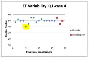
Imagine how different a discussion with a physician will be if we have the opportunity to review our findings visually! If graph after graph we can see how our interpretation compares with a group of our peers, it has an impact. If we can see that we are consistently over/under calling a finding, we will become engaged and want to look further. We may ask for additional clinical correlation to review. Eventually if the clinical correlation and the peer review findings keep showing us the facts we will finally “see” for ourselves and recognize that we need a self-correction.
In the last few months we have used everything from pie charts to scatter-graphs to help physicians “see” their QI results through new eyes. To see their own progress or track themselves against their peers. Here are some examples of visual graphing:
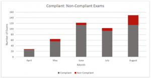
Telling a physician that 35 of their studies were not read in a timely manner is not as effective as showing a graph and helping them see their non-compliant reports in relation to their overall volume. This is an example of a physician that read over 450 studies in 3 months. When you visually see the vast majority of studies read well within the 24 hour allotted time frame (red line) it helps everyone ease up over the 2 – 5 day reads that also occurred that quarter!
Sc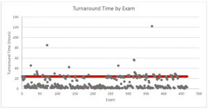 atter-graphs are great when you can visually see a graph that plots all of your dictation times over a period of time. atter-graphs are great when you can visually see a graph that plots all of your dictation times over a period of time. |
Even the good old pie chart will put things in perspective. Of course we all wish for 100% compliance but remember data represents real people with real lives. The data may represent a physician that has been rounding at 3 different hospitals. It could be a physician that was late to pick up her kids from school or a physician that hasn’t had a meal with his wife and kids all week due to working late. So although we would like to see perfect data the reality is that the data can look anywhere along the spectrum of below. So what do I “see”?

As a consultant, viewing data visually has opened my eyes and allowed me to “see” differently too. I strive for excellence so it’s easy to push for perfection. Now when I look at the 3 graphs above I see:
- Graph 1:
A physician that is human - Graph 2:
I see a physician that is struggling so I would want to look closer at the data. However bad 64% compliance sounds, it sure looks a lot more hopeful to visually see the pie chart. Then you can appreciate that the majority of the time the physician is complaint. Is there a pattern to their compliance issues? Is it the weekend reads, set days of the week, panel, non-panel, etc., that is tripping them up? How can I help? How do I recreate the environment that enabled compliance a majority of the time? - Graph 3:
I see a broken system. In this graph, the majority of studies being read in a non-compliant time frame. This tells me to look closely at the workflow and get to the root of the issue. It makes me be gentler on the physician. I will work harder at examining and evaluating the current work flow to identify problems. Then I will find solutions to create a more efficient work flow.
AS A COMMUNITY, HOW DO WE DRIVE CHANGE?
Tracking data and mapping out results has a positive impact on driving change. We are working tirelessly to provide you with new innovative technology that we will allow you to better track your QI measures. It will produce graphic visuals that allows you to “see” your results in a new light. This new platform will also allow physicians to quickly complete peer review from their smart phones, work, home, office or anywhere else on the go! Real time visual feedback regarding variability and turnaround time is powerful. We look forward to sharing our technology with you in the near future.
CardioServ want to here from you! Please share with us how you drive change within your lab. How do you track data? How do you handle variability in regards to physician interpretation? What tools do you use or do you need to drive change within your facility? Leave a comment or contact us directly. Let’s work together as a community to inspire excellence in imaging.


